Design System
Ideation
There are two major challenges within my current organization: inconsistent user interfaces across applications and the increasing number of AODA accessibility tickets during production launches. As I learned more about what Design System were and could do, I began to recognize how helpful it would be to have one.
The department did not have anything like that, except for an HTML template that had been created many years before and not updated since.
Gaining Support
I realized that if I was going to do this, I was going to do it right. The first step was gaining support from upper management who did not understand the value of a design system or why it was even needed.
After making the presentation with the deck (at right) upper management understood what I wanted to do and were able to give the green light for me to go ahead.
Artifacts
Research
I researched industry best practices and presented how a centralized system could improve consistency, development efficiency, and accessibility compliance across teams.
Creation
Once approved, I designed and developed a centralized system containing reusable UI components, design standards, and implementation guidelines. The first version provided documented HTML and CSS components, while JavaScript was used to mimic expected functionality. This gave developers consistent styling and structural foundations without rebuilding common interface elements from scratch.
As adoption grew, it became clear that providing only HTML and CSS was not enough to consistently ensure AODA compliance across applications. To address this, the Design System evolved into a reusable code repository with fully developed and accessibility-tested React and Angular components. Developers could now implement approved, production-ready code directly into their applications while maintaining accessibility standards.
Results
The Design System improved collaboration between design and development teams by establishing a shared visual and technical language. It reduced development time, minimized inconsistencies between products, and significantly lowered accessibility-related issues during QA and production reviews.
Today, the Design System continues to evolve with new components, updated documentation, and accessibility-tested code libraries that allow teams to build scalable, consistent, and compliant applications more efficiently.
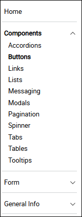
A screenshot of the navigation used in the design system. It started as a simple list and later evolved to contain four sections pictured here.
Components contains all of the components that we regularly use such as accodions and tooltips.
Form contains all the form components, as well as how in-line form errors should appear and how how the overall form error handling should function.
General Info contains more explanitory items such as the correct tone to use, how to organize style sheets and what naming conventions to use when creating new styles.
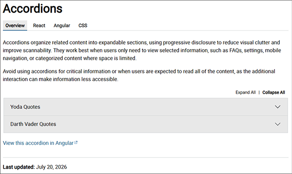
A screenshot of the overview page content for the accordion page.